Below is an article originally published by Brenda Hu at PowerToFly Partner Intent. Go to Intent's page on PowerToFly to see their open positions and learn more.
My days are usually filled with product design work, but I had the opportunity recently to go back to my roots as a graphic design hobbyist and work on illustration for our internal marketing and on-boarding materials. The objective was to create visuals for our company's prized cultural statements, known as the six pillars of "How We Roll." The moment you step in the doors of <intent> you can sense the people's fun-loving camaraderie and dedication to success, and we wanted the illustrations to reflect that.
I knew these icons would be a lot of fun to create, but I could not have predicted how nuanced the implications of each design would be. Below I will share how each iteration was a valuable lesson throughout the design process.
Ideation – Sketching out characters for "How We Roll"
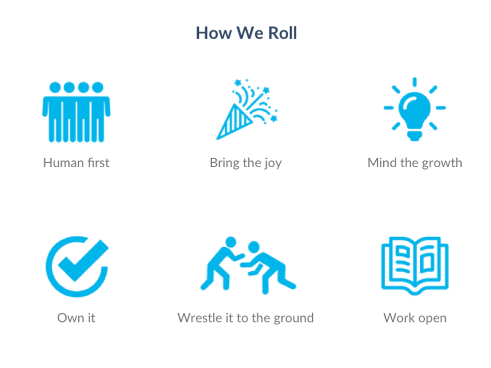
Before diving into the artwork, our People Manager and I kicked off our ideation session by reviewing the company's new and improved cultural statements. Everything this company inspires in an employee and instills in a work culture is summarized into the following six slogans of "How We Roll" paraphrased below:
- Human first: we are free to be our whole selves at work and care about creating community
- Bring the joy: we bring our passion, joy, and dogs to work — we're also a little weird
- Mind the growth: we invest in our people and cultivate a growth mindset to make way for leaders
- Own it: we have autonomy because we are trusted, and accountability because we commit
- Wrestle it to the ground: we seek the truth even when it's hard, are unafraid of complexity, and out-think competitors
- Work open: we share our work and performance transparently, and we stay open to innovation
Next, we looked at the icons currently used in our training materials:
 Original icons for our cultural statements
These were okay — illustrative enough as icons, but they certainly could use more detail and life! Adding a human element with illustrations would enrich the messaging immeasurably. So we started brainstorming imagery that would get people excited and reinvigorated about a refreshed set of cultural values:
As far as the style and branding goes, for our first pass we agreed upon the same style that I previously used for creating internal marketing materials: bright colors from our company style guide and solid outlines for a casual feel.
Though we began the project with this direction, we'd soon evolve the style to fit the desired tone of the messaging.
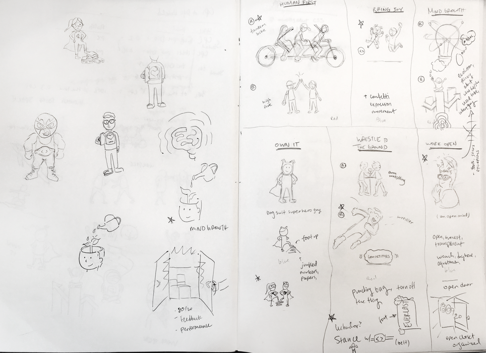
New directions – Design and conceptual growth
For Version 1, we focused on the usage of brand colors and the outlined caricature style to deliver the first set of illustrations below:
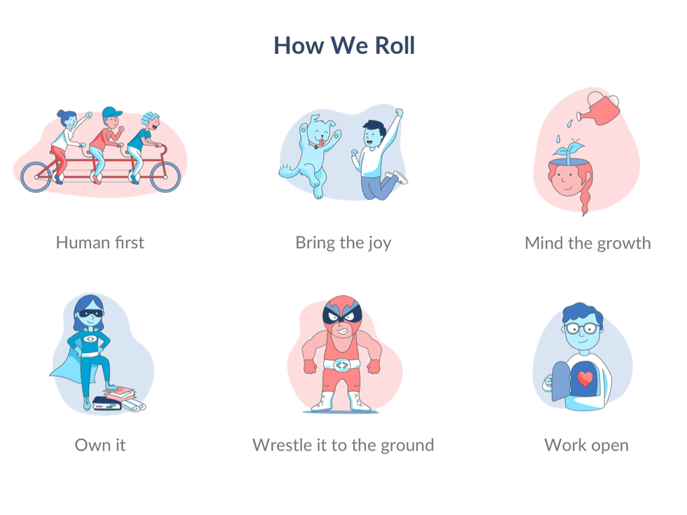 Version 1 — The feedback we got was that this style felt a bit too whimsical, like the characters on a kid's show.
Upon reviewing with the stakeholders, we realized that a few images didn't quite represent the intended message. For example, while the tandem bike symbolized teamwork and community for "Human First," they believed the "Work Open" image could more suitably be used to describe our "Human first" mindset.
Another piece of feedback we got was that these images were too whimsical and "cartoon-ish." Great for laptop stickers, but maybe not the best representation of our brand, should these ever be used in our on-boarding and training materials. In retrospect, we should have delivered just a couple of these Version 1 images to serve as prototypes and hash out branding concerns earlier. Applying a workflow similar to the lean UX process we use when designing new products would have allowed us to iterate faster — so that was a great lesson to carry forward for future illustration projects. Thus we pivoted to a completely new look and feel.
For Version 2, we opted for a more sophisticated, mature style below:
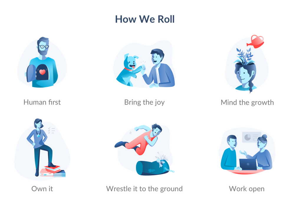 Version 2 — Stylistically more sophisticated and bolder. The feedback was positive, but we all felt they were still missing something.
These illustrations were met with more enthusiasm from our stakeholders as they were more polished and matched the tone of our company values. Brand colors were still used, and a few of these had been reimagined from scratch such as adding the punching bag of "problems" to "wrestle to the ground," and two people "working open," mid-conversation. There was just one more piece of feedback that would be the crucial final touch.
Embodying Diversity
This was the last piece of the puzzle. With the blue skin tones and variety of features on these characters, I had tried to reflect the idea of diversity within a unified whole. But what originally was well-intentioned actually resulted in viewers seeing the characters under a different lens — a weird diminishing of diversity because everyone was blue. It was one of those enlightening moments as a designer when you revisit something at a later time with a fresh perspective and notice a glaring issue. We realized that despite the recent graphic design trend in using blue people to solve diversity problems, there was so much more that we can do to strengthen what and whom these characters represent.
So we started brainstorming again what it means to be more inclusive with these designs. I started with basing these characters off of images of actual people. It was a challenge balancing the right amount of detail — too much, and the characters felt like very specific individuals whereas too little, and they reverted back to the previous problem of appearing homogeneous — both of which would make it hard for every employee to see themselves represented. In the end, merging both realistic features (distinct articles of clothing, wrinkles, body types, hairstyles) and surreal features (the myriad of skin tones and gradients) provided a touch of ambiguity to allow the characters to represent a group of people, not one specific person. Obviously discussing the nuances can get tricky and we were stumped sometimes — is this too try-hard, did we capture everyone — but we ended up with something that hopefully resonates with as many people as possible in the final version below:
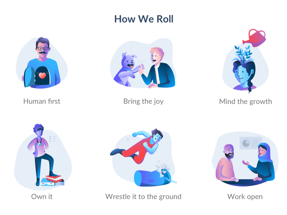 Version 3 — Final version, with a more colorful palette and deliberate representation of diversity.
Conclusion – How we roll
Our cultural statements encompass everything that this company looks for and encourages in an employee and serve as the mantra of what maintains our ideal work environment. Through this design process of personifying each value of "How We Roll" in a unique illustration, I am reminded of just how impactful every element of the design is in symbolizing our company culture, from style and branding to emphasis on representation. Reconciling the many implications of designing for inclusivity continues to be one of the main areas of improvement for any designer, whether it's product design or visual design, and I am eager to keep developing these skills to do my part in reflecting what people value in their everyday life experiences.