Below is an article originally written by Melyssa Cramer, Senior Interactive Designer at PowerToFly Partner Kargo, and published on October 11, 2018. Go to Kargo's page on PowerToFly to see their open positions and learn more.
The mobile landscape is ever-evolving, but our core best practices have remained constant for our award-winning design team at Kargo. Follow along below for our top five mobile design principles to see how we keep our units looking as fresh as the latest Yeezys.
1. Contrasting Colors
Utilize contrasting colors for the most important information within the ad.
While we want color palettes to be cohesive, choosing a contrasting color for interactive elements within a mobile ad is important to attract user attention to the desired action. When determining call-to-action button colors, select a color that pops against the background content. Users will be able to clearly identify the call-to-action and will be more likely to engage.
2. Easy to Engage
Keep interactive elements within reach of a user's navigation finger for easier engagement.
According to a 2017 study* by Steve Hoober, a mobile UX expert, 75% of people only use one thumb to interact with their phone screen. Keep this in mind when choosing the layout for interactive elements of your design. The biggest "hotspots" on a mobile device are in the middle or near the bottom of the screen. Primary functions, such as swiping through a product carousel for engagement, should be kept near the middle of the screen, while secondary functions, such as tapping a call-to-action button for CTR, should be kept near the bottom of the screen. This ensures that the user is easily able to interact with the unit without frustration.
*https://www.uxmatters.com/mt/archives/2017/03/design-for-fingers-touch-and-people-part-1.php
Link: https://s3.amazonaws.com/kargo.com/wp-content/uplo...
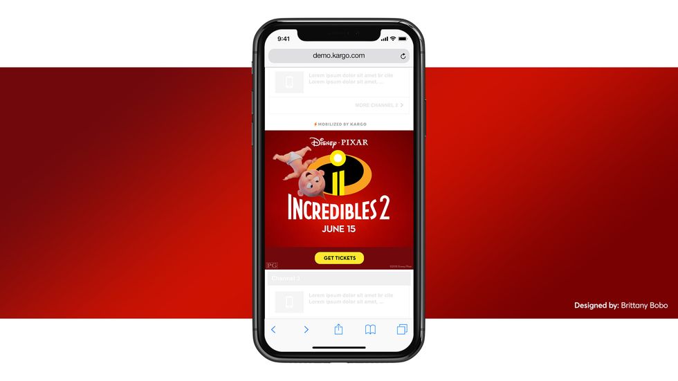
Use bold, beautiful imagery to drive home our value of keeping "art in ad tech."
Space limitations on mobile devices require marketers to be more strategic about the way they populate the ad canvas. At Kargo, we strive for all of our units to include very clear product or lifestyle imagery to help draw users in, especially for our in-article placements. With text-heavy articles and the quick-scrolling nature of mobile device use today, users are more likely to notice a beautiful, bold image versus an ad full of lengthy blocks of text. This visual stimulation acts as a contrast against the site content – this theory is the basis behind our Key Art product, which relies on very little messaging, allowing the imagery to tell the brand story.
Link: https://s3.amazonaws.com/kargo.com/wp-content/uplo...
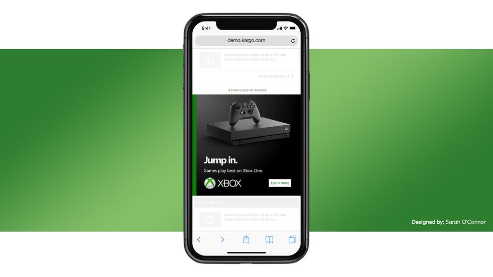
4. Less is More
Focus your creative around the most important elements and get rid of the extra fuss.
Similar to the previous best practice around beautiful imagery, Kargo is a big proponent for "less is more." Space is constrained on mobile devices, so layout becomes even more crucial when designing your ad. While it may be enticing to cram in every bit of info as you can, this could actually detract from the overall message & negatively impact user engagement. We advise having one main line of messaging, the headline, with limited supplemental copy. Pair this with one primary focal-point product image and a very clear call-to-action, and you have a recipe for success.
5. Animated vs. Static
Draw in user attention by the use of motion.
While beautiful imagery & concise messaging can capture attention, the best way to further engage your audience is by the use of animation. Using movement & unique transitions helps give the finished product a premium feel and aids in drawing the user deeper into the experience. Go one step further and incorporate user-controlled scroll-reactivity, which can boost in-view time by up to 25%.
Link: https://s3.amazonaws.com/kargo.com/wp-content/uplo...
Stand with Kargo and stand out against the clutter of on mobile screens. Incorporating these best practices into your creatives will captivate your user base and entice them to engage.