Below is an article originally written by Brian Beavers and Christina Chang at PowerToFly Partner Stash, and published on July 25, 2018. Go to Stash's page on PowerToFly to see their open positions and learn more.
Stash's employee and customer base have been on a rocket ship with no signs of slowing down. As our design, research, and marketing team have continued to grow at Stash, we realized that we needed a new way of getting eyeballs on our work and getting timely critiques.
Like many product design teams, we use a combination of Sketch + Zeplin for design, feedback, and specs for engineering. But shoehorning feedback into Zeplin seemed like a misuse of the tool to us. We take vacations and sick days. We are often heads down busy with our own tracks of work on our squads. We're in meetings or discussions throughout the building and can miss important threads on Slack or Zeplin. We often lack context behind certain projects, thereby missing the hypothesis and goals behind a particular solution.
So my first pass at revitalizing how we do design critiques was by setting a standing one hour meeting every Wednesday afternoon (midway through the week to allow for time to prioritize design work and iterate within our squads) with the following mission:
The purpose of this meeting is to have open and timely critique among team members and stakeholders. It is also to foster a more collaborative, human environment where we gather around, look at the work in-progress, and discuss our product solutions with each other in real life. The hope is that this will lighten some of the Zeplin discussions, give everyone a dedicated time to review work, push for more design consistency across squads and leave Zeplin for more engineering-based usage.
And this was the format:
- 1 hour long, 10–15 minutes each per squad or project (with timer)
- Take the first five minutes of critique to walk around the room to look at the work printed
- Write notes, questions, or feedback on stickies in relation to the project
- To keep the meeting efficient and keep everyone's attention, please take long discussions offline.
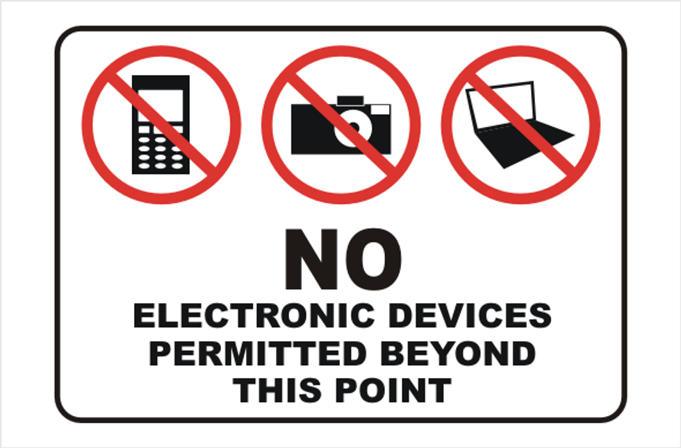
- No phones or laptops
- Stand up and discuss around each other's designs
- Attendees: All product managers and product designers from each squad, ux researchers, copywriters, and marketing designers
Designer:
- Print out your flow or design(s)
- Set the stage for the audience. Walk them through the challenge or problem statement, the goals, and the hypothesis.
- Tell the audience what type of feedback you're looking for (user flow, interactions, general UI, copy, etc.)
- Tell the story. i.e. "The customer will be coming to this page from a button on home. Only customers who have a bank linked will see this."
- Tell the audience the goal(s) i.e. "We want to encourage customers to Auto-Stash more than $15/week."
Coordinator + Timekeeper (Another designer or PM):
- Focus the audience on the critique, the goals, the hypothesis, and the feedback the designer is looking for.
- Please keep everyone's time in mind so that all designers have enough time to present; especially if lengthy or non-relevant discussions come up
- Make sure everyone has the opportunity to speak up. Oftentimes you'll find the quiet ones provide the most valuable insights.
Audience:
- Ask clearly defined questions i.e. "What were you trying to achieve with the placement of the icon there next to the headline?"
- Be candid and honest. It shouldn't be a compliment sandwich. Feedback should sound like, "Having Stash Cash preselected feels like an efficient way to move the customer through the funnel." or "When you show too many payment options, it gets confusing and overwhelming, especially on mobile".
- Tie everything back to the goals and/or hypothesis. It should not be about liking or disliking the design. How is it meeting or missing the business and/or customer goals?
- Provide directional suggestions, but avoid problem solving
This product and marketing design critique format worked for awhile. Then we ballooned to 25+ attendees. Having 25+ people stand around an 11x17" print-out of a flow required magnifying glasses. After a few months of print-outs, we pivoted to a structured Google Slides format where the goals, the hypothesis(es), and link to the prototype or Zeplin were presented on a TV.
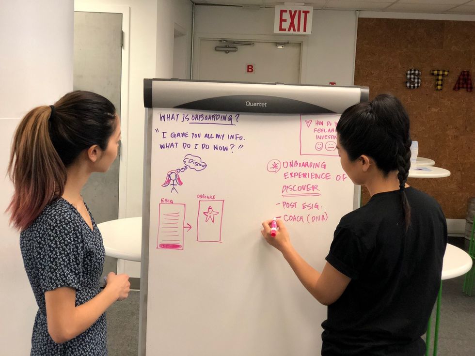
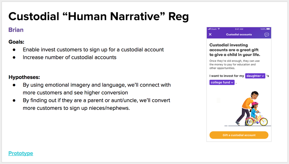 *This image is for illustrative purpose only.
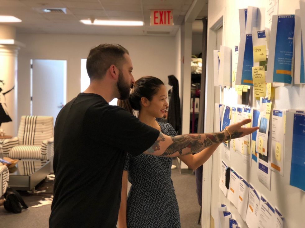
But we started to lose focus. Then attendance started to dwindle as work that was being presented became less relevant for some in the original meeting invite. And then we started to feel like the feedback wasn't quite as timely or as focused as it had been in the earlier iterations with 10–12 people.
So we went back to the drawing board.
Christina Chang (one of our new Product Designers at Stash) had a friend that recommended an intriguing critique format called Tactical Design Critiques. The dramatically different approach convinced us this was worth trying:
- Small groups only — for us this meant only involving our small product design team of 6–7
- One designer comes prepared with work to get critiqued, throws it up on a projector or large TV. The designer can't say anything to explain their work to the rest of the group.
- The rest of the group goes around the table, and one at a time says onepoint of critique or tension. Everyone is discouraged from giving compliments and building compliment sandwiches.
- If you don't have a point of critique, you can skip. If you don't understand a person's point of critique, you can ask them to clarify.
- Most importantly, you cannot ask the designer any questions and they can't jump in to respond and clarify.
- At the end of 25 minutes of critique, the designer can take 5 minutes to summarize and explain how they will take the feedback into their designs.
At first, this format felt like it was potentially limiting since designers are so used to providing context and defending their work. But, we quickly discovered that the designers became silent note-takers scribbling to capture feedback, and thereby less attached to their own work, able to step back and simply listen.
Because it often feels too intense in normal critiques to give so many suggestions, this format created the opportunity for comments on everything from copy to color to user flows to consistency. It's a twist on user testing, except with users that happened to be designers you work with.
We've found it to be a very refreshing way to deep dive into one user flow at a time, and hone in on problem areas without involving egos.
Design critiques, much like design itself, can never truly be "perfected" or "done", in our opinion. Audiences change, timelines change, team dynamics change, team needs or priorities are constantly shifting. As they say, change is the only constant. We're still figuring out what works best for us.
References to design critique formats we used to iterate on ours:
https://medium.com/@suelynyu/a-practical-guide-to-running-effective-design-critiques-c6e8166c9eb0
https://uxdesign.cc/the-why-and-how-of-effective-design-critiques-944313947fe4
https://medium.design/tactical-design-critique-bb74d1a5e350
https://medium.com/@monteiro/13-ways-designers-screw-up-client-presentations-51aaee11e28c